
Customise your table view
- Purpose
- Choose which columns show, pin and reorder them, add column totals and highlights, or switch a table to a board.
- Who is this for
- Everyone
- Prerequisites
- At least one record in the module.
- Permissions
- View access to the module. Changes to a saved tab are kept only when you save the tab.
Every module that lists records (Projects, Staff, Programs and so on) shows them in a table. You decide which columns appear, in what order, how wide they are and what totals sit at the bottom. Your workspace may use different names for the modules, but the controls are the same everywhere.
How it works
The toolbar above the table holds the controls you use most:
| Control | What it does |
|---|---|
| Search box | Narrows the rows as you type. See Filter, sort and group. |
| Filter | Opens the filter dialog. |
| Download | Exports the view. See Export data. |
| Import data | Imports records from a CSV file. Admins only. See Import from CSV. |
| Customise | Opens the Customise panel described on this page. |
| Add | Creates a record. The button names the record type, for example Add Project. |
Changes you make in Customise apply straight away. There is no Apply button. To keep a layout for next time, save it as a tab (see Create and manage tabs).
Open Customise
- Click Customise in the upper right corner of the table.
- Work in the Data tab to change columns, or the Highlights tab to colour cells and rows.
- Click Close or press Esc to close the panel. Every change you made stays.
Each column has one row in the list. From left to right a row holds a drag handle, the column name, a pin, a gear and an eye. Hover over any icon to see what it does.
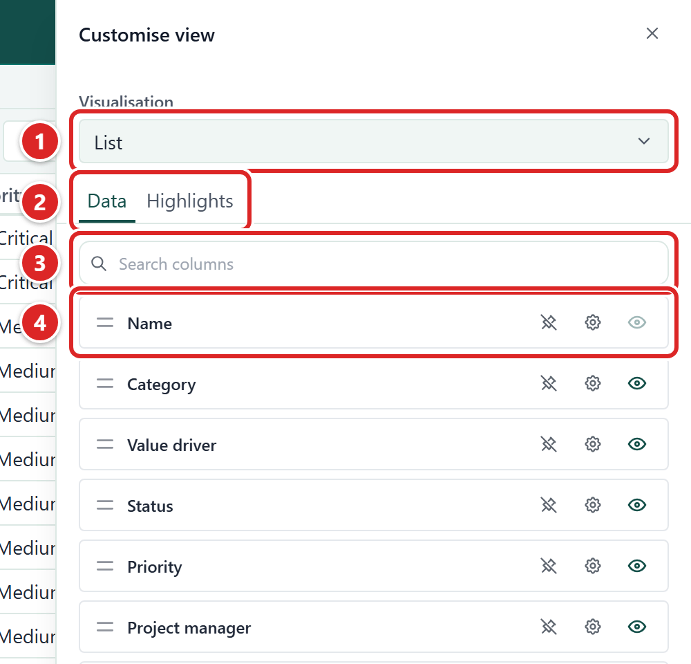
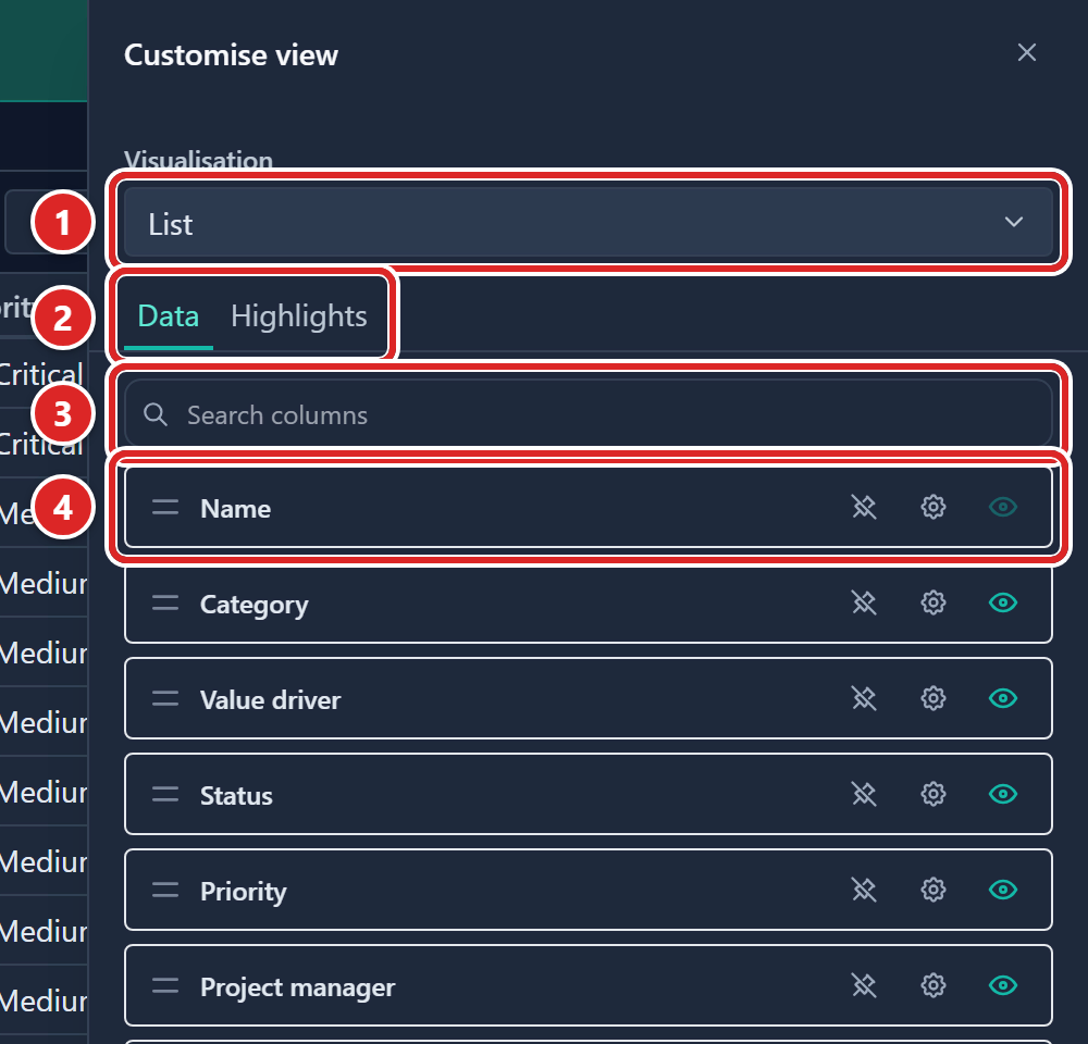
- Visualisation: switches the module between a list and a board.
- The Data and Highlights tabs.
- Search columns: type here to find one column when you have many.
- A column row: drag handle, name, pin, gear and eye.
Show or hide a column
- Open Customise.
- Click the eye on the column's row. The column disappears from the table, or comes back.
A hidden column is still listed in the panel, and you can still filter by it. The eyes in the panel always match the columns the table shows, on every page, including Tasks, OKR and RAIDD.
The Name column cannot be hidden. Its eye is greyed out, and a tooltip reads Name is always visible. If a saved tab or preset hid Name, it shows anyway. On Tasks, OKR and RAIDD, Delete is greyed out for Name too.
Show the ID column
Every record has an ID, such as RISK-12, set by Gembaa and read-only. It is a column like any other. Tabs made before the ID column existed hide it, so show it in Customise if you want it.
- Open Customise.
- Click the eye on the ID row. The column appears in the table.
In a tab with no saved column order that never hid it, ID is the first column. On Tasks and OKR it comes right after Name. If you show an ID that a tab had hidden, it stays where Customise lists it.
Sorting is numeric-aware, so RISK-2 comes before RISK-12. Filter it with the text operators, and quick search matches it. Exports include it while it is showing.
Mini-tables inside a record (see Customise mini-tables), and Card fields on a board, offer ID but do not show it until you add it.
Reorder columns
The Customise panel and the table stay in step, so use whichever is quickest:
- Drag a row by its handle in the Customise panel.
- Drag a column header in the table. A line shows where the column will land. Press Esc to cancel.
- Right-click a header and choose Move left or Move right.
- Select a column header and press Ctrl + Shift + ← or → (Cmd on a Mac).
You cannot reorder columns in the panel while Search columns is narrowing the list. Clear the search first. An open Customise panel follows any move you make in the table.
Name moves like any other column. Where a row has child rows, the expand and collapse toggle, the indent, the type icon and the Restricted badge stay with the Name column wherever you put it.
A move that crosses the pinned edge asks you first. See Move across the edge.
Pin columns
Pinned (frozen) columns stay fixed at the left edge while the rest of the table scrolls sideways. Use them for the name or id you always want in view.
- Open Customise.
- Click the pin on the column's row. Click it again to unpin.
Pinned columns are always one block at the left. A hidden column cannot be pinned until you show it. If you show a hidden column that sits inside the pinned block, it is pinned too. Name can be pinned or unpinned like any column.
Move across the edge
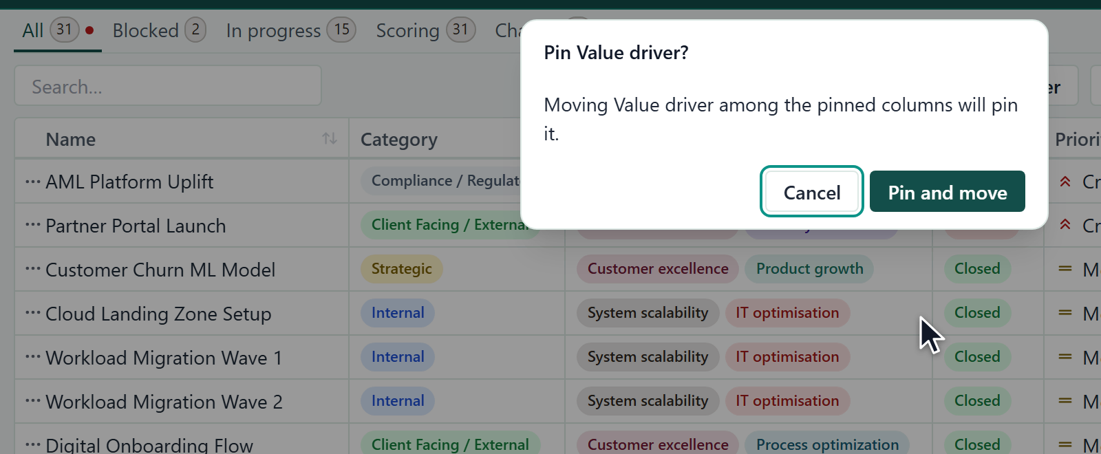
Any reorder can cross the edge between pinned and unpinned columns: dragging a row in the panel, dragging a header, Move left or Move right, or the keyboard shortcut. Gembaa asks before it changes the pin.
- Move a column so that it lands among the pinned columns, or after them. Gembaa asks Pin (column name)? when the column would become pinned, or Unpin (column name)? when it would become unpinned.
- Click Pin and move or Unpin and move. The column moves and its pin changes.
To change nothing, click Cancel instead of step 2.
Change column width
- Drag the edge of a column header to resize it.
- Double-click the edge to fit the column to its longest value.
- Right-click any header and choose Auto resize all columns width to fit every visible column at once.
- Right-click a header and choose Set all columns to this column's width to give every column the width of that one.
The first time you open a view that has no saved widths, Gembaa fits the columns to their content for you. This applies to the entity tables, the OKR tree, RAIDD, Pulse, the Allocation list and the Gantt left table. It does not apply to dashboard widgets.
The fit does not count as a change, so Save changes does not appear. Widths you have saved always win. Gembaa keeps the fit only while the page is open, so it runs again on your next visit until you save widths in a tab.
Set totals and format
- Open Customise.
- Click the gear on the column's row.
- To show a total or summary in a footer row at the bottom of the table, choose an Aggregation.
- Choose an Alignment: Left, Center or Right.
- For number and currency columns, choose Rounding (None, K (thousands) or M (millions)) and Decimal places. The table updates at once.
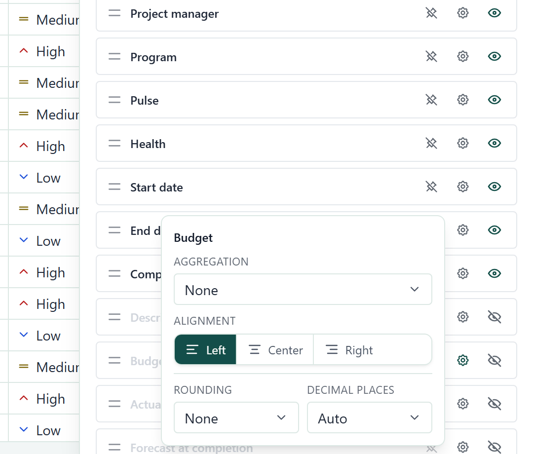
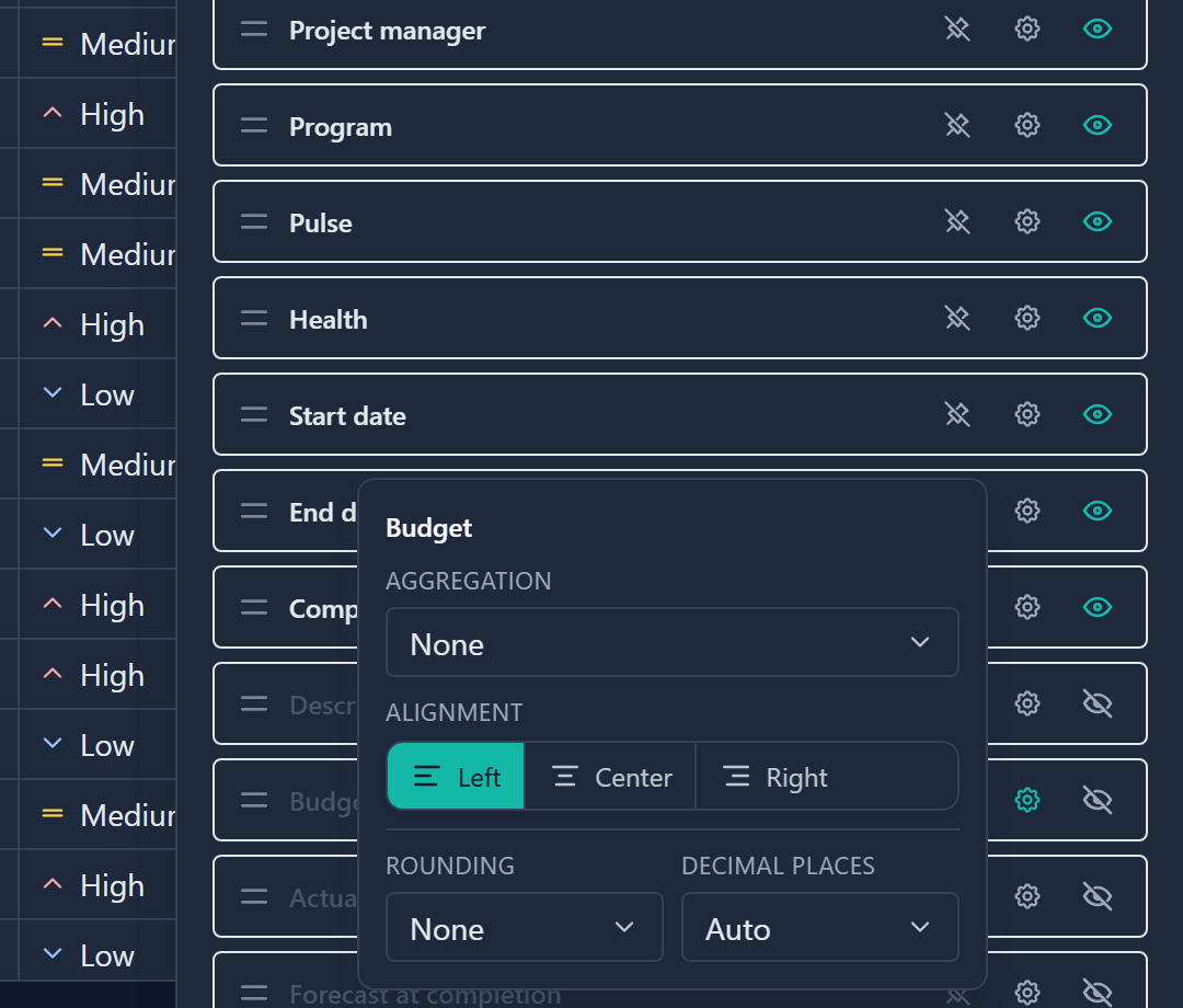
The aggregations offered depend on the column type:
| Column type | Aggregations |
|---|---|
| Text, priority, relation and most other types | None, Count, Unique count |
| Select, status | None, Count, Unique count, Most frequent |
| Number, currency | None, Count, Unique count, Sum, Average, Min, Max |
| Date, date range | None, Count, Unique count, Earliest, Latest |
The footer totals only the rows currently shown, so it changes as you filter or search. Hover over a footer cell to see which aggregation it is. A column with no values shows a dash.
Highlight cells or rows
Highlights colour a cell or a whole row when a condition is true, for example a due date in the past.
- Open Customise and switch to the Highlights tab.
- Click Add. The Add highlight dialog opens.
- Pick the Column. You can pick several columns, but only columns of the same type can share a rule.
- Pick the Condition, then a value or another column to compare to.
- Next to Highlight, choose Cell or Row.
- If you chose Cell, choose the cells to colour under Cells to highlight.
- Choose a background colour.
- Optional: if the column allows it, choose a text colour, bold, italic or underline.
- Click Add. The rule joins the list and the table is coloured at once.
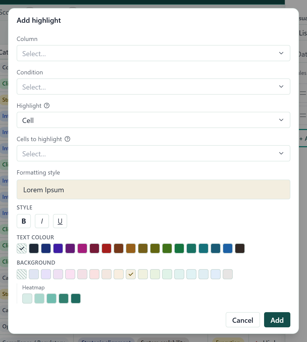
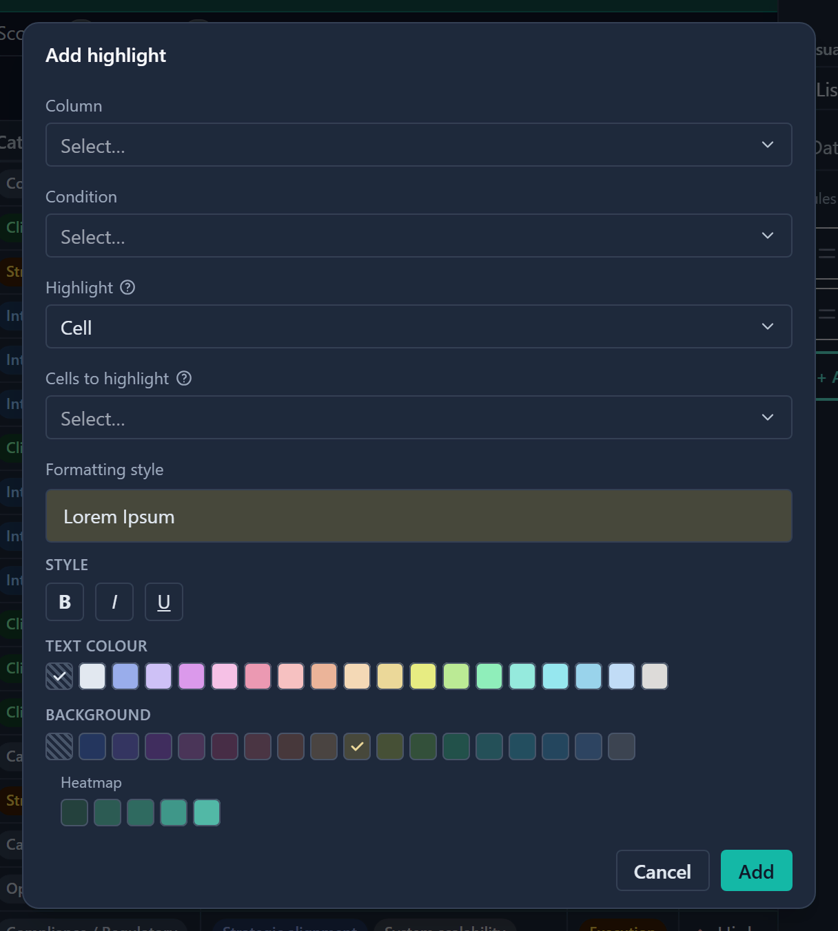
The background colours include a Heatmap row, which is a five-step scale. Some columns can take only a background. Gembaa then tells you that text colour, bold, italic and underline are unavailable until you remove that column from the rule.
Rules are evaluated from top to bottom and the first match wins. To give a rule priority, drag it up, or open its Rule options menu and choose Move to top. The same menu has Move to bottom and Duplicate. Highlights also appear in Excel and PowerPoint exports.
Switch to a board
Some modules can show records as a Kanban board instead of a table.
- Open Customise.
- Change Visualisation from List to Kanban board.
The board has one column per status, plus a No status column for records with no status. Filters and search still apply. A long column loads in pages: click the Load … more button at the foot of the column to see more cards.
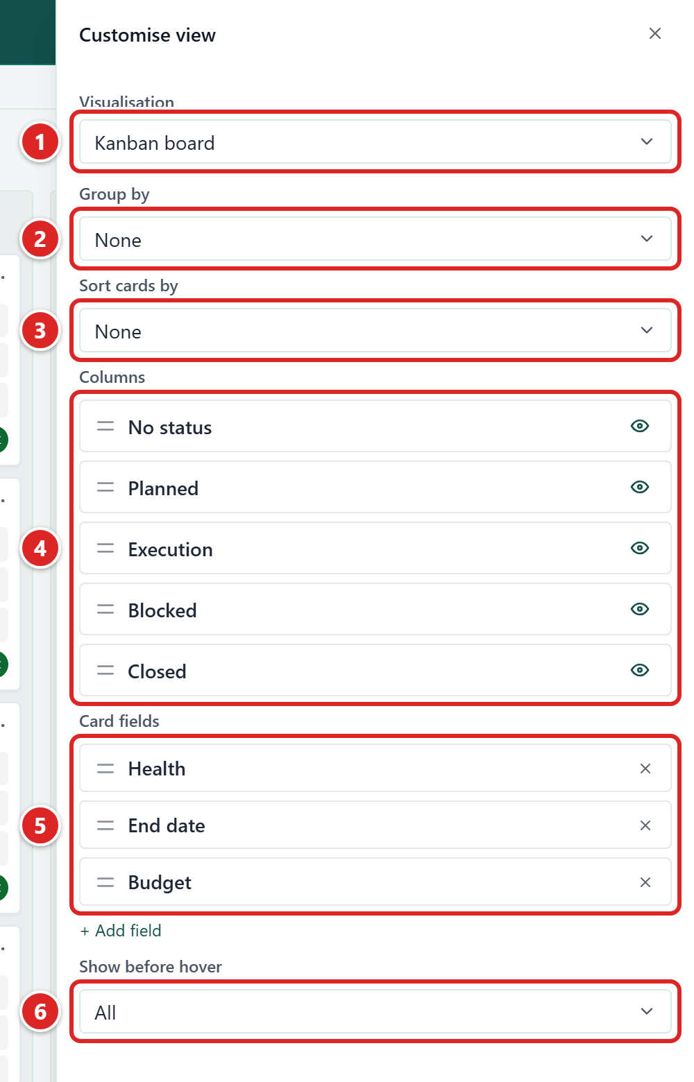
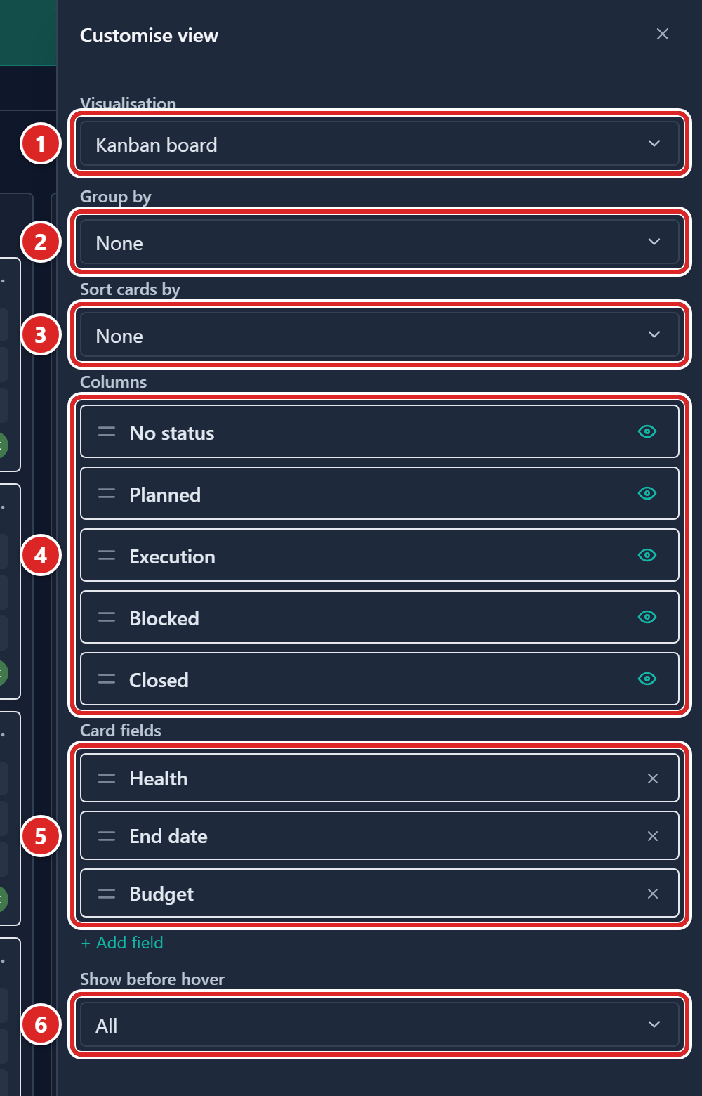
- Visualisation, set to Kanban board.
- Group by.
- Sort cards by.
- Columns.
- Card fields, below Columns.
- Show before hover.
| Setting | What it does |
|---|---|
| Show level | Appears on pages that mix record types, such as Tasks and OKR. It picks which type of record the board shows. |
| Group by | Adds horizontal lanes by a relation or select field. Choose None for a flat board. Cards with no value in that field sit in a lane named after the field, such as No department. |
| Sort cards by | None, Name (A → Z), Name (Z → A) or Manual (drag to arrange). |
| Columns | Reorder or hide status columns. |
| Card fields | Picks which fields each card shows, up to 6, and in what order. See Choose card fields. |
| Show before hover | Sets how many card fields show until you rest the pointer on a card. It appears once the card has two or more fields. |
When lanes are on, the Expand all swimlanes and Collapse all swimlanes buttons beside the search box fold or unfold every lane at once.
On the board:
- Drag a card to another column to change its status, or to another lane to change the grouping field.
- Click a card to open the record panel.
- Double-click a card's name to edit it in place. A card title saves when you click away.
- Double-click the value or name of a card field to edit it in place, as in the table. Formula and rollup fields cannot be edited.
- Use Add under a column to create a record with that status already set.
The no-value lane, for example No department, starts collapsed while it is empty. To clear a card's value in the grouping field, drop the card on that lane's header. The card keeps its status.
When lanes are grouped by a relation, the lane header shows that record's name and status. Click either to edit it in place. Press Enter to save or Esc to cancel.
If a card cannot be moved, it is locked and a tooltip explains why. Usually you do not have permission to edit the field, or the lane field is required and the card has no other lane to go to.
Choose card fields
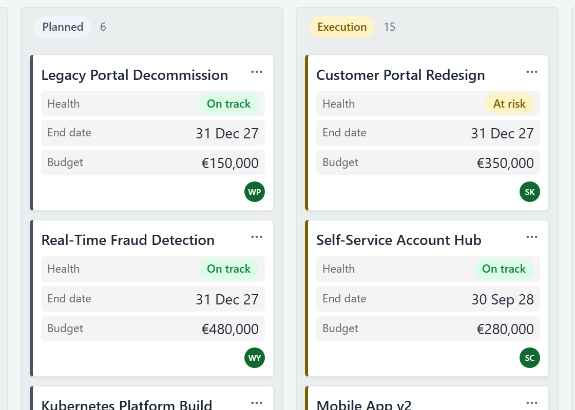
A card always shows the record's name, a left border in the colour of its status and an avatar for the person field (such as Assignee). Card fields adds more, each as a name and value row. Card fields belong to the board view. On the Tasks and OKRs pages, each level (for example Objective and Key Result) keeps its own list.
- Open Customise and make sure Visualisation is Kanban board.
- Under Card fields, click Add field. A searchable list of fields opens.
- Choose a field. It joins the list and appears on every card.
- Optional: Drag a field up or down in the list to change the order on the card.
- Optional: Click the remove button on a field (its tooltip reads Remove (field name) from the card) to take it off the card.
- Optional: Under Show before hover, choose how many fields to show at rest. The default is All.
- To keep the layout, click Save changes.
A card holds up to 6 fields. At 6, Add field tells you to remove one first. The card's name, Status and the avatar's person field are not in the list, because the card already shows them.
With a number under Show before hover, each card shows that many filled fields. The rest, and any field with no value, appear when you rest the pointer on the card. A field with no value shows a dash. The list offers All and every number below the count of fields on the card.
Edit a cell in place
Edit a text, number, date, select, status or priority cell without opening the record.
- Double-click the cell.
- Type or pick the new value.
- Press Enter to save, or Tab to save and move on. Press Esc or click away to discard it. A short "Not saved" note confirms that nothing changed.
In a select or status cell, picking an option saves it. In a multi-select cell, or a relation that allows several records, tick your choices and click Update.
The new value shows at once. A small cue above the cell says "Saved", or "Couldn't save · reverted" if the change was refused and the cell went back to its old value. Formula and rollup cells cannot be edited in a table. If a formula cannot be worked out, hover over its cell: the tooltip asks you to contact your administrator to correct the formula.
Customise mini-tables
Some tabs in the record panel list related items in a mini-table, for example Milestones, SOWs, RAIDD, Members and Knowledge. Each has its own search, Add button and Customise button. Its Customise panel works like the one above (the first tab is called Columns), minus pinning and board view. After you change a layout, Reset to default appears at the bottom of the panel. Click it to go back to the standard columns.
The Links tab is not a mini-table. Its rows have no Customise, sort or column settings. See Link records.
Tables that show items under a parent, such as Tasks and OKRs, have expand and collapse buttons beside the search box: Expand all rows, Collapse all rows and Expand to a specific level.
Good to know
- A column's order, widths, visibility, totals, highlights, sort, filters and grouping are all saved with a tab. Until you save, the Save changes button shows.
- Mini-table layouts inside a record are not part of a tab. Gembaa saves them for you straight away, and they apply to that list in every record of the same type.
- Tooltips open after a short pause of about 0.3 seconds, and also when a control has keyboard focus. Text that is cut off in a cell shows in full in a tooltip.
- On a narrow screen, such as a phone, the table turns into a list of cards, one per record.
- Board sort, manual card order and collapsed lanes are saved at once, without using Save changes. Group by, Columns, Card fields and Show before hover wait for it.