
Dashboard
- Purpose
- Build your own dashboards from charts, tables, scorecards and Pulse matrices, and jump from any widget to the records behind it.
- Who is this for
- Everyone
- Prerequisites
- View access to the modules whose data you want to chart.
- Permissions
- Dashboards are personal. You can build and change your own. Pinned dashboards set by an admin are read-only.
The Dashboard is the first item in the left menu and the page you land on after signing in. It is your own canvas of widgets: charts, record tables, headline numbers and Pulse matrices, each reading live data from any module in your workspace.
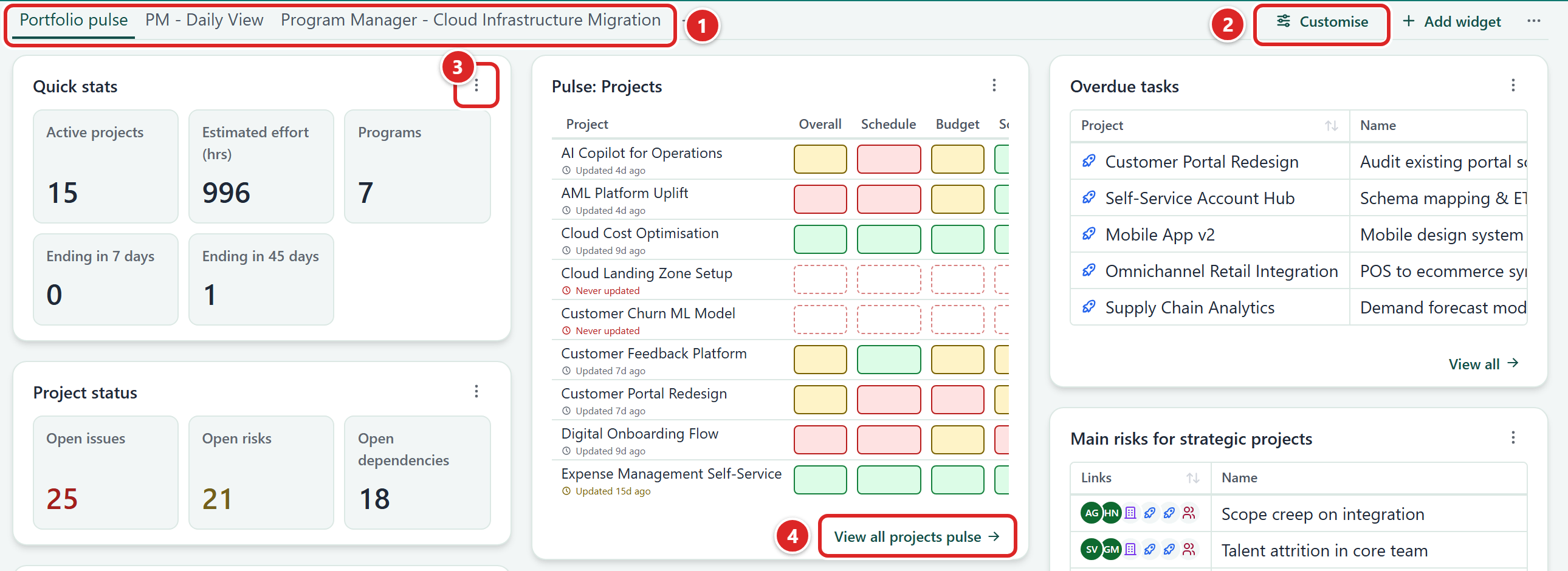
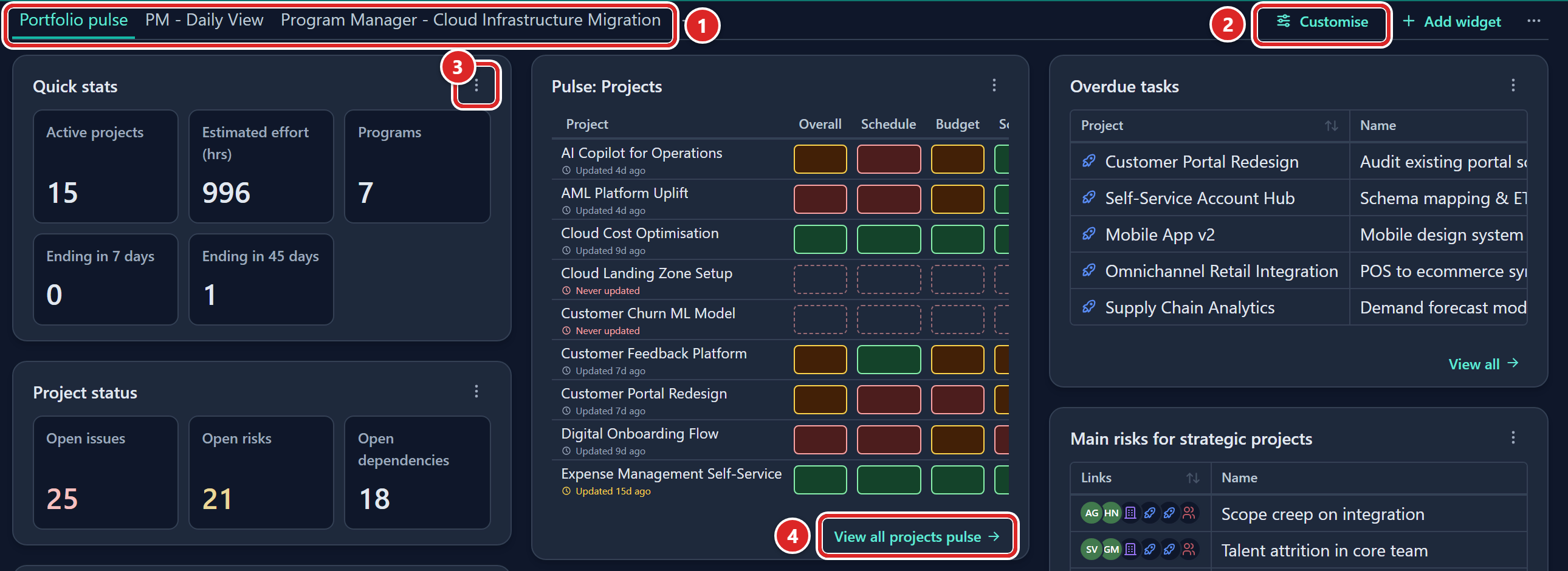
- The dashboard tabs. The plus button at the end of the row adds another tab.
- Customise, next to Add widget and the View options button.
- A widget's Widget menu button.
- View all, at the foot of a widget.
How it works
- Dashboards are personal. Each user has their own tabs. Nobody else can see or change yours, and you cannot see theirs.
- Tabs hold widgets. Create as many as you like, for example one per program or one for your weekly review.
- Widgets respect access. A widget only counts records you are allowed to see, so two people with the same widget can see different numbers.
- Widgets are read-only. To change a record, open it from a widget or go to its module.
- A new user starts with the default tabs an admin has set up in Preset tabs. If there are none, the page shows Add your first dashboard with an Add dashboard button.
- A Pinned dashboard from an admin shows its widgets but cannot be edited, renamed or reordered.
Widget types:
| Group | Types |
|---|---|
| Bar | Bar, 100% bar, Stacked bar, 100% stacked bar, Time series bar |
| Line and area | Line, Area, Stacked area, 100% stacked area |
| Pie | Pie, Donut, Variable radius pie |
| Radar | Radar (line), Radar (area) |
| Other charts | Treemap, Funnel |
| Other widgets | Table, Scorecard, Pulse matrix |
Add a tab
- Click the plus button at the end of the tab row (its tooltip reads Add dashboard). The Add tab dialog opens.
- To start from an empty dashboard, click Blank. The Add dashboard dialog opens.
- Enter a Tab name and click Add. The new tab opens and is empty.
To start from a dashboard your admins have suggested, pick it in step 2 instead. It is added straight away with its own name.
In the Add dashboard dialog, Enter adds the tab. Esc or Cancel creates nothing. A blank name is refused. Tab names do not have to be unique.
Manage tabs
Right-click a tab for Set as active tab, Rename, Duplicate, Delete, Move left and Move right. You can also drag a tab left or right, or press Ctrl+Shift with an arrow key on a focused tab.
- Set as active tab makes that tab open whenever you come to the Dashboard.
- Duplicate copies every widget into a new tab named with "(copy)".
- Delete works only while you have more than one tab.
Reset tabs
To replace your dashboards with the ones your admin set up:
- Click the View options button in the tab row.
- Choose Reset tabs to defaults. Gembaa replaces all your dashboards with the admin's defaults and shows "Reset all dashboards".
Add a widget
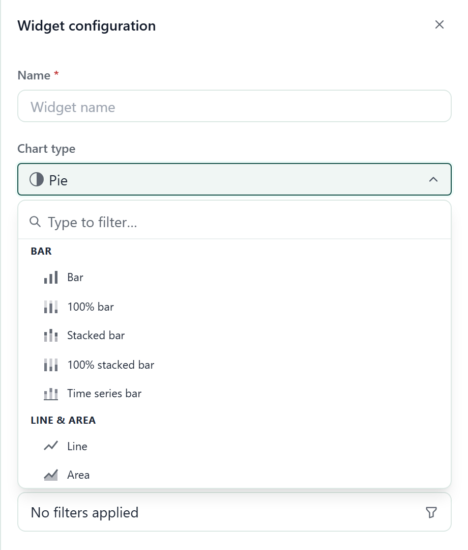
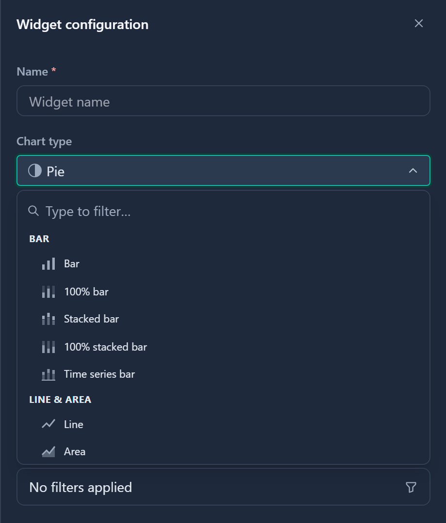
- Click Add widget in the tab row. The Widget configuration panel opens.
- Type a Name. A widget cannot be saved without one.
- Pick a Chart type. The list is searchable and grouped by family.
- Choose a Data source, which can be any entity in your workspace.
- Choose Group by, the field that splits the data into slices or bars.
- Choose a Measure. Count (records) is the default.
- If the measure is Sum, Average, Min or Max, pick a numeric field as the Measure field.
- Optional: click Filters to narrow the records. Filters work like filters in tables, and all rules must match.
- Click Save. The widget appears at the end of the tab.
Some chart types add more options:
| Option | What it does |
|---|---|
| Then group by (series) | Splits each bar or area into a second dimension. Required for stacked types, optional for Bar, 100% bar, Line and Area. |
| Bar direction | Switches bar charts between Vertical and Horizontal. |
| Time dimension | For Time series bar: the date field to plot. |
| Show legend | Turns the legend on or off. It is not offered for Radar, Treemap or Funnel, which name their categories on the chart. For Bar, 100% bar, Line and Area it appears once you choose a series. |
Add a table widget
A table widget lists records instead of charting them.
- Add a widget and set Chart type to Table.
- Choose the Data source and any Filters.
- Under Columns, show or hide fields with the eye toggle.
- Drag the fields into the order you want.
- Set Rows to show to 5, 10 or 25.
- Optional: add Cell highlights. Pick a field, a condition, a value and a colour. Matching cells are shaded.
- Click Save.
The Columns list offers every field of the data source, including the platform columns such as Latest Pulse, Allocation, Current rate and Skills.
Their cells show a loading placeholder for a moment and then fill in. The Latest Pulse column is wide enough to show its whole grid.
A highlight condition is one of equals, not equals, contains, greater than, less than, is empty or is not empty. The last two take no value.
On the card, drag a column edge to resize it, click a header to sort, and click a row to open the record in its panel. Cells show the same pills, avatars and links as the module tables. When the table is limited, a line reads "Showing N of M records".
Add a scorecard
A scorecard shows several headline numbers on one card. Each number is its own tile with its own data source, measure and filters, so one card can mix, say, active projects and staff.
- Click Add widget in the tab row.
- Set Chart type to Scorecard.
- Under Metrics, click Add metric. The Edit metric dialog opens.
- Enter the Metric label.
- Choose the Metric data source.
- Choose the Measure.
- Optional: add Filters and pick a Colour.
- Click Done. The tile appears under Metrics.
- Repeat steps 3 to 8 for each tile.
- Optional: drag the bars to reorder the tiles.
- Click Save.
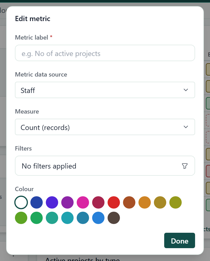
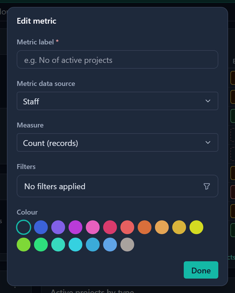
A tile that counts nothing shows 0. A sum, average, minimum or maximum with nothing to calculate shows a dash. To rename a tile caption on the card, click it, type, and press Enter.
Add a Pulse matrix
A Pulse matrix shows the health of each project, program or other Pulse-enabled record at its latest check-in, as a grid of coloured chips.
- Add a widget and set Chart type to Pulse matrix.
- Choose the Pulse source. Only entities with Pulse switched on are listed.
- Choose which Indicators to show.
- Optional: turn on Show the Overall column, Show status labels and Show forecast arrows.
- Set Rows shown to 5, 10 or 25. Rows are sorted by name.
- Optional: click Filters to narrow the records by field or by Pulse state.
- Click Save.
The matrix is for reading only. To file a check-in, go to Pulse.
Open widget records
Click View all at the foot of a widget. You land on the module's table with the widget's filters already applied, so you see exactly the records that were counted. For a Pulse matrix the link opens that entity's Pulse page.
A Scorecard has no View all, because each tile reads its own data source. To see the records behind a tile, open that module and apply the same filters.
Arrange and edit
- Click Customise in the tab row.
- Choose Columns: 2 or 3. A narrow window shows fewer columns than you pick.
- Under Widgets, drag a row to move a widget. The change applies at once, with no Save.
- On a row, click a button to open that widget's settings, duplicate it or remove it.
- Optional: click Add widget to add one.
Every widget is one column wide. New widgets fill the shortest column first.
To change a single widget, open its Widget menu on the card and choose Rename, Configure, Duplicate or Remove. Remove takes effect straight away, with no confirmation.
Good to know
- Widgets with no matching data say why: Nothing here yet, No matches or No dates to plot. A Pulse matrix says Pulse is switched off here if an admin turned Pulse off for that entity.
- A widget whose data source an admin has switched off in Turn features on or off is not drawn, and the data source list does not offer it. A scorecard keeps its other tiles.
- Table widget cells cannot be edited on the dashboard. Open the record to change it.
- A widget over a module where records exist but none are visible to you shows a no-access message instead of "nothing here yet".
- Widgets group and total records in your browser, so a widget over several thousand records can be slow to draw.
- Pinned dashboards hide Customise and Add widget. Ask an admin if you need a change.