
Theme and colours
- Purpose
- Create branded themes with your own colours, logos and font, check contrast, and choose the workspace default.
- Who is this for
- Admins
- Permissions
- Admin role.
A theme is a complete look for Gembaa: its colours, logo, favicon and font. You can create as many themes as you need, for example one per client or brand, and choose which one is the workspace default. Members can pick any theme for themselves, and also choose light or dark mode, in Your settings.
How it works
Every theme has two palettes, Light and Dark. Members see one or the other depending on their mode setting, which is Browser default, Light or Dark.
Two themes are built in and cannot be edited, renamed or deleted: Gembaa, the standard look, and High Contrast, a theme designed to be accessible. To change either, duplicate it and edit the copy.
You manage themes in Administration → Colors & themes. The page has one tab per theme, each with a colour swatch. The workspace default carries a Default badge. Below the tabs, the left side holds the controls and the right side shows a live preview of the whole app using your unsaved edits, in the palette you are editing.
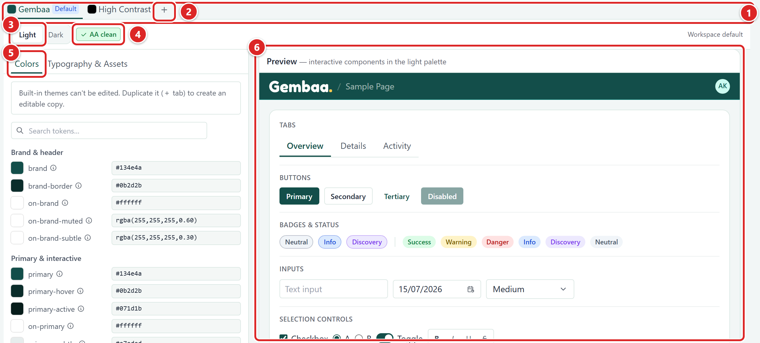
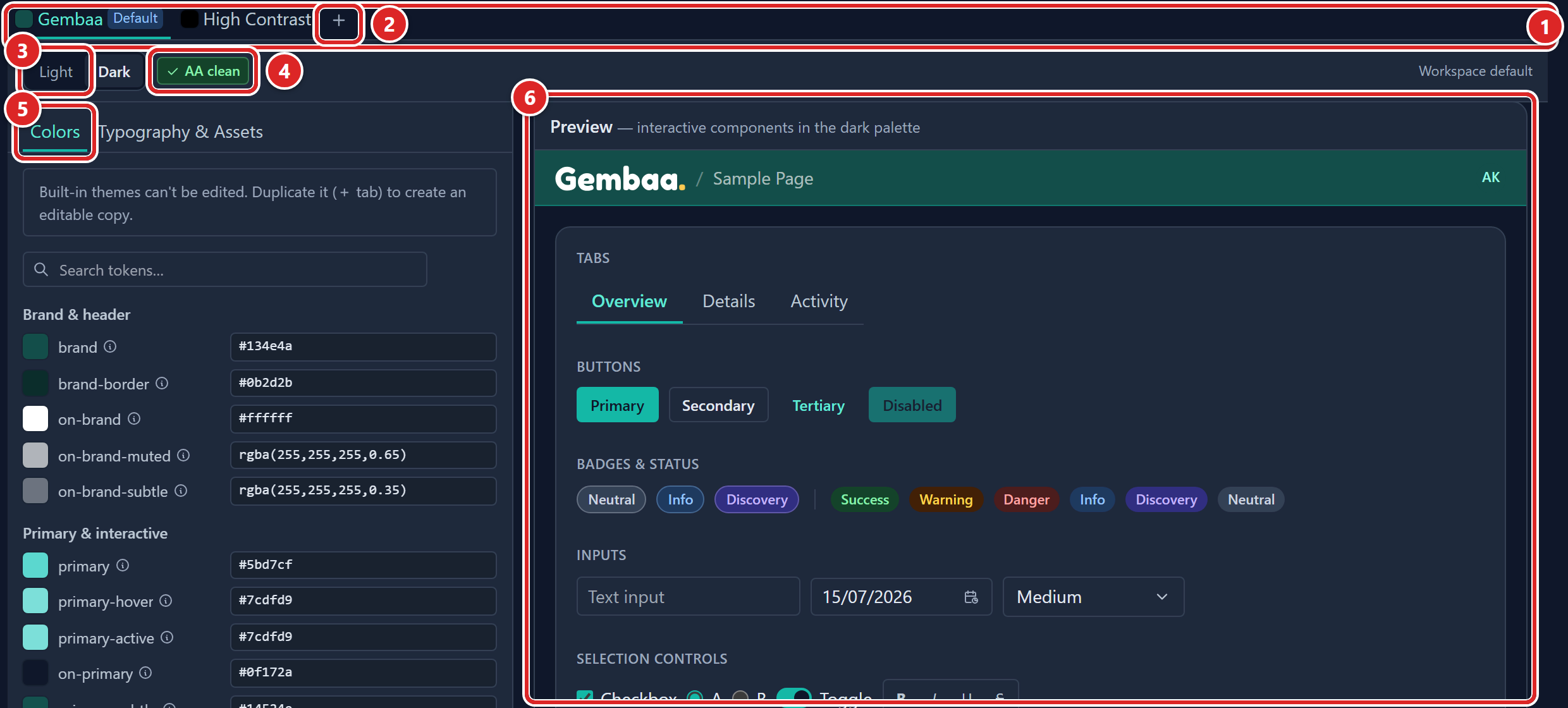
- The theme tabs, each with a colour swatch.
- The plus tab that adds a theme.
- The Light and Dark toggle.
- The contrast result, here AA clean.
- The Colors and Typography & Assets sections.
- The live preview.
Add a theme
- Open Administration → Colors & themes.
- Click the plus tab at the end of the tab bar.
- In the Add theme dialog, enter a name, for example "Client A". Names must be unique.
- Choose Start from, the theme to copy colours, logos and font from.
- Click Add. The new theme opens in its own tab, ready to edit.
You can also right-click a custom theme's tab and choose Rename, Duplicate or Delete, and drag custom tabs to reorder them.
Edit the colours
The Colors section has two editors, Guided and Advanced, switched with the toggle at the top of the page.
The toggle, Discard and Save show only on custom themes. A built-in theme opens read-only in Advanced, with a note that built-in themes cannot be edited and that you should duplicate one to get an editable copy.
| Editor | What it shows |
|---|---|
| Guided | A small set of brand colours for the Light palette, grouped as Brand, Surface & text and Status. Everything else, including the whole Dark palette, is worked out for you so that it meets WCAG AA contrast. |
| Advanced | Every colour setting, grouped by role, in either the Light or the Dark palette. Use Search tokens… to find one. Setting a value here replaces the automatic one for that palette only. |
Use the Light and Dark toggle to choose which palette you are looking at. Both editors also have Entity colors, the identity colour of each entity in the sidebar, dashboard and record icons, per palette. Click Reset to defaults to go back to the derived values.
An entity whose feature is switched off in Turn features on or off keeps its row in Entity colors, greyed out with the words Feature disabled and no colour to pick. Its colour is unchanged and returns when the feature is back on.
- Open the theme's tab and make sure the Colors section is selected.
- Choose Guided or Advanced.
- Click a colour to open the colour picker and choose a new value.
- Watch the preview on the right. Switch between Light and Dark to check both.
- Click Save.
Check contrast
A contrast panel at the bottom of the controls grades every text and background pair in the palette against WCAG AA. Its header shows the worst result, such as AA clean or a count of contrast issues, so you can see whether the palette is safe without opening it. Each failure lists the ratio and the ratio it needs.
You can still save a palette with contrast failures. The app asks you to confirm with Save anyway.
Set font, logos, favicon
Open the Typography & Assets section.
| Setting | What it does |
|---|---|
| Typography | Chooses the font family from a fixed list: System default, Georgia (serif), Trebuchet, Verdana and Courier (mono). It applies to both palettes. A sample line shows the result. |
| Light logo | The logo for the Light palette. PNG, JPEG or WebP, up to 2 MB, with a transparent background. You can save a theme without one. |
| Dark logo (optional) | Used in the Dark palette. If you do not add one, the light logo is used. |
| Favicon | The icon in the browser tab. A square PNG, up to 256 KB. |
To add or change a logo or the favicon:
- Click Upload, or Replace if a file is already there.
- Choose the file. A preview appears.
- Click Save. Until then the upload is only a preview.
Before you save, you can undo a pending change or remove an asset.
Below the assets, this section also holds the PowerPoint template card. It sets your company's slide master for PowerPoint exports, applies to the whole workspace and is not saved with a theme. See PowerPoint template. If PPT export is switched off in Turn features on or off, the card is replaced by Feature disabled and an Open Features link.
Save or discard
While a theme has unsaved changes, a notice tells you how many there are and to click Save before you leave the page. The Save button shows the number of changes, and the theme's tab shows Unsaved.
Each theme keeps its own draft while you stay on the page. Save and Discard act on the theme you are viewing.
Saving makes the theme live. Members see the change the next time they load or move to another page. If you try to leave with unsaved changes, you can Stay, Discard and leave or Save and leave.
Set the default
The default theme is what members see until they choose another.
- Open the tab of the theme you want.
- Click Set as default. The tab gets the Default badge.
You can also right-click a theme's tab and choose Set as workspace default. On the default theme's own tab, the button is replaced by the words Workspace default.
Members who have chosen their own theme keep it. Members who chose the default follow it, including when you change it later.
Delete a theme
You cannot delete the theme that is the workspace default. Set another theme as default first.
- Right-click the theme's tab and choose Delete.
- In the confirmation, click Delete theme.
Members using the deleted theme fall back to the workspace default on their next load.
Good to know
- The built-in themes are read-only. Duplicate one to start from it.
- If someone else changed the theme while you were editing, the page asks you to reload before saving.
- Theme changes are recorded in the Admin activity log.